Affinity Design
Service Design for Educational Organizations
Case Studies
What changes when you see it
the way families do
Two projects, years apart and very different in size. In both, the people being served were struggling with something the people in charge couldn't see from the inside. Each one started by looking from the outside in.
COOPERATIVE PRESCHOOL
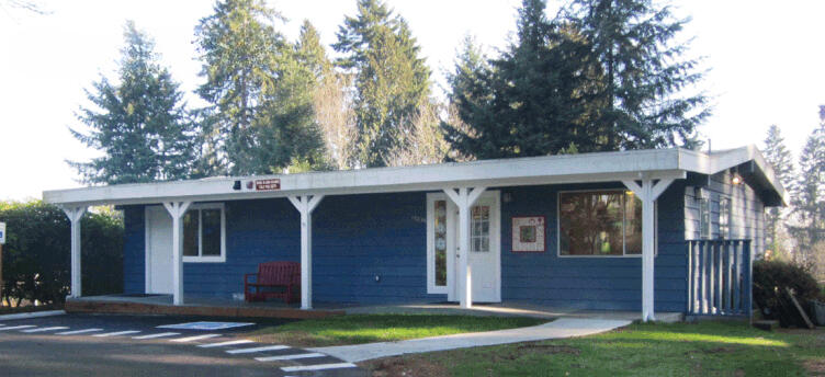
A storm, a move, and two more classes.
A school community faced a decision that touched every family at once. It moved to a new home over one summer, grew from 4 classes to 6, and didn't miss a day of school.Who it's for: school heads, microschools and co-ops facing a big change.
What the two have in common:
Both organizations knew their own work well. What they couldn't see was the experience from the other side: the family deciding whether to stay, or the mailer hunting for a rule. That outside view is what I bring to every project.
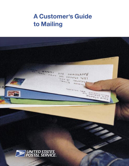
U.S. POSTAL SERVICE
A 1,500-page rulebook, rebuilt for the people who use it
Readers kept calling for answers the manual already held. Rebuilt around how people actually work, it won six design awards and was adopted across the Postal Service.Who it's for: any school or co-op whose handbook or enrollment packet sends families to the office for answers.